
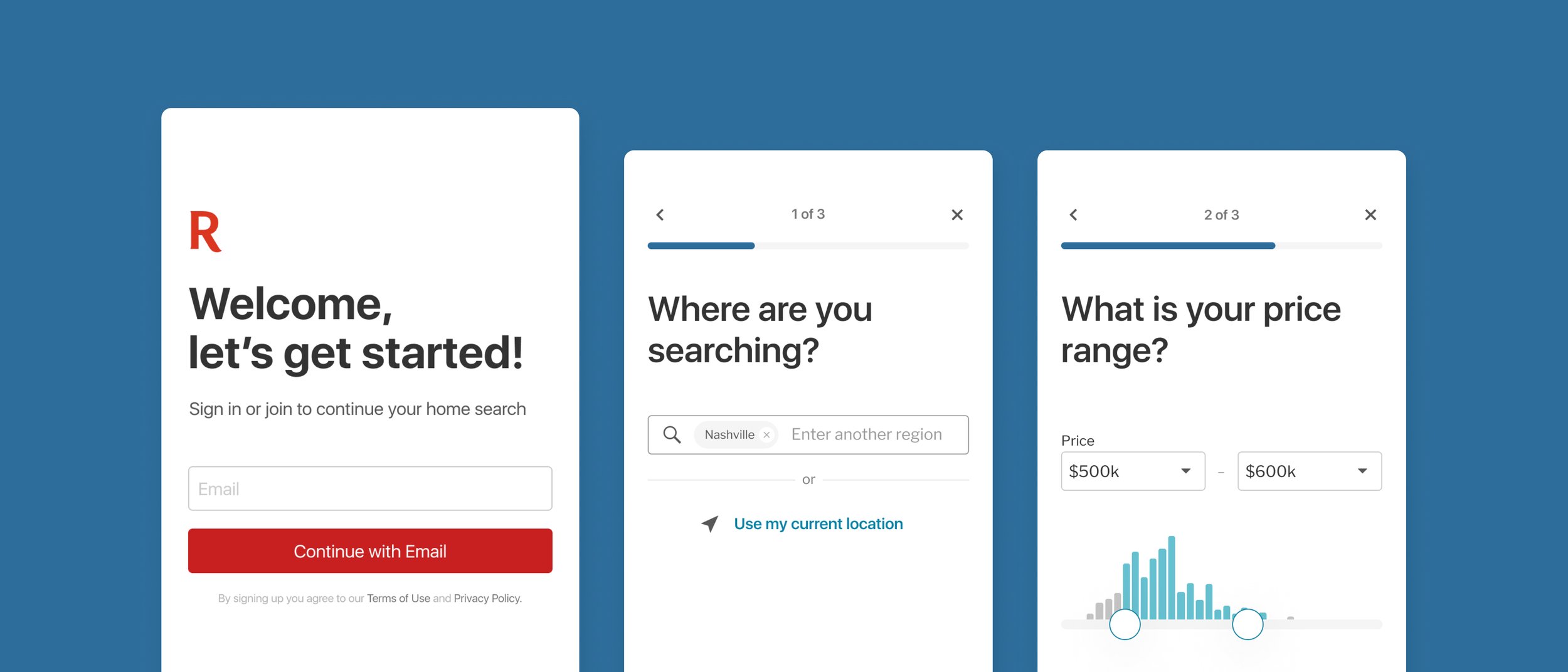
Native Onboarding
Giving users the tools to start their search or pick up where they left off.
Overview
Project Brief
Not enough users are getting their ‘search’ setup (signing in, applying filters, signing up for notifications) in the app, and it’s making it more difficult to find homes they care about. We know that signing in, applying filters, and signing up for notifications (push/email) are strongly correlated with returning to the app and eventually working with the brokerage, yet not a lot of our new app users are performing these actions.
User Problems
I’m not sure where to start searching or, if I have a search set up, I don’t where how to continue my search.
The Goals
Objective
Get users setup to find homes they care about, which encompasses two components:
Finding homes they care about in the app
By signing in, we’ll be able to load any existing searches and feed updates
By setting filters for their search to serve relevant homes in the feed and on the map
Getting homes they care about delivered to them.
By signing up for email updates and push notifications
User goal
New User: I want an easy way to search for homes so that I can find homes that match my criteria.
Existing user: I want an easy way to pick up from where I left off.
Business goal
Drive more new onboarding’s and increased 14-day retention
My Contribution
Team
I worked in a cross-functional team as the sole product designer. I conducted a usability tests to validated our assumptions and was involved in all phases of the project.
Responsibilities
Qualitative Research, Visual Designs, User Experience design, Prototyping and Testing
The Process
Here I will outline and describe my process for solving this problem.
Research · Ideation · Design · Test
Research
Defining the problem and understanding the “Why” with user research and data collection.
Understanding
In order to determine a problem, I pulled in a few feedback reviews and customer calls highlighting favorites improvements. I later conducted a few user interviews to understand how users are solving this issue today. Additionally, in order to get a holistic view of the user’s journey my PM and I analyzed click-through rates on our detail pages as well as the favorites page to help identify user actions.
After understanding the core problem users were facing, I mapped out the user’s journey to better understand where user’s were having the most difficulty.
Why ‘Shortlist’
In addition, the research uncovered that in-order to deliver the best experience for both agents and users, we must give users the ability to create a small list of their most favored homes to choose from. Giving users the ability to add up to three homes will allow users to make trade-offs, which is a crucial step in decision making.
While conducting interviews with our agents, we learned that agents were asking their customers to choose between 3-5 homes they felt more serious about. Given this research, we decided to name this feature ‘Shortlist’.
Key Findings
As users became more serious in their home journey, they found themselves narrowing down and separating homes they were more inclined to take the next steps on.
Key Quote Take-away
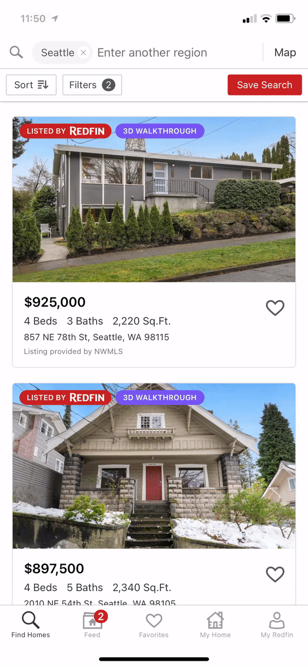
“Currently, I use your site to search and save all my favorites and I use Zillow as a means of tracking my favorites of my favorites.”
— Raegan, Relocating to Ohio
Ideation
Gathering ideas and executing on potential solutions.
Wire-Framing
Mapping out the user’s journey proved helpful at this stage. I now understood where users were having difficulties.
Within our product space, I organized and identified areas where users would favorite homes.
After identifying the various favoriting entry-points, I wireframed potential UX Shortlist entry-points.

Narrow down solutions
There were various solutions to this problem. However, after understanding where users were having difficulties, I decided to focus on those areas.While conducting interviews with our agents, we learned that agents were asking their customers to choose between 3-5 homes they felt more serious about. Given this research, we decided to name this feature ‘Shortlist’.
Shortlist Icon
After several rounds of icon iterations, the ‘Shortlist’ icon was born. The idea would be that a heart would represent Favorites and a start would indicate a super favorite.
Test
Testing hypothesis
Usability testing
There were a few versions that could potentially solve this problem. However, in order to understand which version best-solved user’s problems, I conducted a few user tests to validate assumptions.
This research aims to explore how users interact with this new feature.
Our hypothesis is that by allowing users to add homes to their top favorite, we believe user will become more successful in finding their forever home and are more inclined to contact us as a brokerage.
We ultimately want to understand if the overall experience is intuitive, frictionless, and discoverable.
Results from findings
Shortlist Discoverability: Unfortunately, users had a hard time figuring out how to add a home to their Shortlist.
Add to Shortlist: After observing all 8 users who participated in
Shortlist Full: All 8 users who were tested did not experience any difficulty adding or removing a home on the Shortlist Full experience.
Take-aways
Overall, users did not have any difficulty adding homes to their Shortlist. However, discoverability seemed to be an issue and after talking to my PM our solution was to add an onboarding flyout on first load.
Flyout added for discoverability.
Final Design
Design Conclusion - Always iterating
Add to Shortlist
Shortlist Full

Learning
Discover ways to improve
Customer Calls
After launching the feature, we found users asking to expand the Shortlist from 3 to 5-10. In order to understand the true solution my PM and I conducted a few customer calls to help understand their requests.

Jessica
Background
Serious buyer
Moving to a new state
Military family who moves every 3 years.
Seriously considering 10-20 homes
Requests: Wants 5-6 homes in her Shortlist. She would use Shortlist to help when touring homes.
Quote:
“I would have used it as our itinerary for the day.”

Brad
Background
Recently purchased a home
Moving to a different county in SoCal
Heavy Redfin user, has over 500 favorites
Just purchased a home the day before our call.
Requests: Wants 10 homes in his Shortlist and used the feature to prioritize homes he wants to tour or take notes on.
Quote:
“For me, it became not just an app or a site, but an organization tool...”
Results from findings:
We found that despite users asking to expand Shortlist from 3 to 5/10 what they were asking for was a completely new feature that allowed them to organize homes they cared about. After listening to their requests and parsing through the data we decided to keep Shortlist as is. However, this research would later lead to a new problem we want to solve. 😊
More Work

Web Onboarding
Helping users with their homes search by highlighting core feature in Redfin’s product.
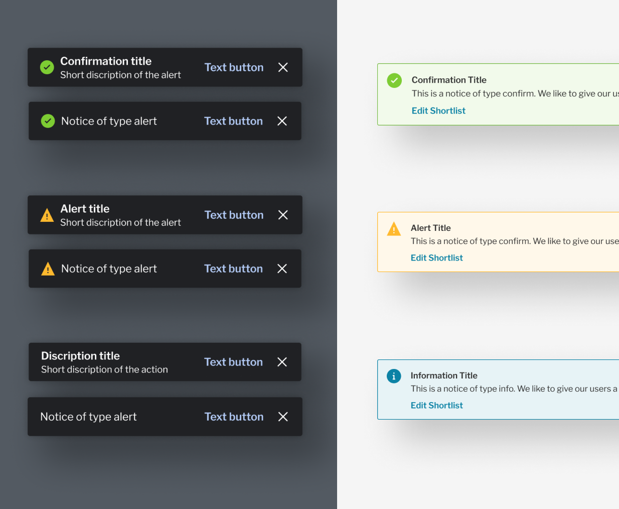
Notice Components
Fixing outdated components

Feed
Coming soon